Joel Tjintjelaar
Architecture Photography in Black and White
Joel Tjintjelaar shares tips on creating stunning black and white architectural photos.
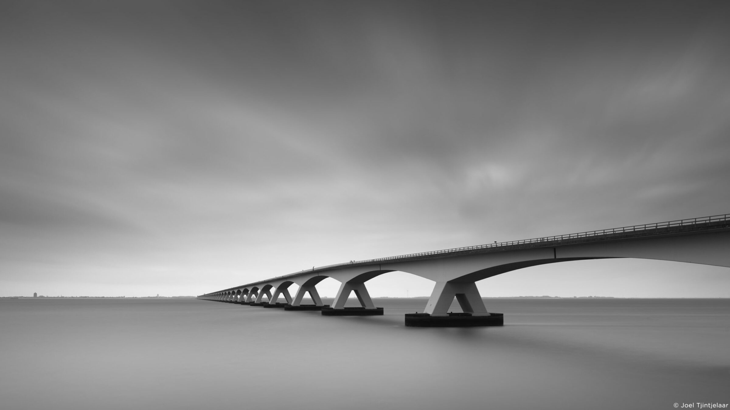
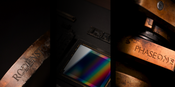
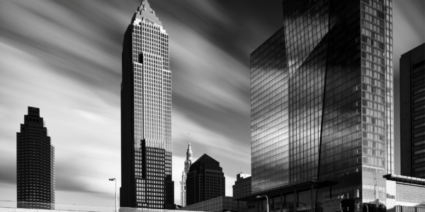
Award-winning black and white architectural photographer, Joel Tjintjelaar, took in hand Phase One’s 100MP Achromatic and spoke with us about his love of black and white photography. He explained how he uses an absence of color to add depth to his images.
There’s a quality to the black and white photos from this camera that feels like the beautiful analog photos from the past that I’ve never seen before in digital.
How would you describe yourself as a photographer?
“I would describe myself as a photographer who aims to create art. Photography is just a medium to express myself emotionally and create beautiful things. I try to create art by moving away from reality as many steps as possible. I’ve always felt that moving away from reality is a way of creating aesthetics. One way is by working in black and white, since our real world is not a black and white world. I have other ways of moving away from reality, like working with long exposures and exaggerating the differences in luminance to create a strong sense of depth in an image.”
“I like exploiting the fact that depth perception is generated in the colorblind part of the brain. So my desire to move away from reality in my photography plays an important role in the photographic style I have.”
What do you feel photographing architecture in black and white does for your images?
“It amplifies the look and feel of visual depth. As indicated earlier, I’m using architectural objects for my photographs. It’s instinctive and they represent symbols in the same way Stieglitz’s clouds, for example, represented something different than clouds. Furthermore, I have indicated that the perception of depth takes place in the colorblind part of our brain. We perceive depth only through the differences in light: through differences in luminance values or contrast. Not through color.”
“An architectural object largely has geometrical shapes and therefore lends itself perfectly to be rendered as an object with depth. Black and white, in combination with the use of perspective lines, is the best, and perhaps the only, way to do that.”
What’s the difference between taking a picture in color and taking a picture in black and white?
“Black and white is seeing and working in luminance values or contrasts only, about working in visual depth, and seeing a world that’s different from the objective real world. It’s always a subjective presentation of a world in itself. Working in color is working in a world closer to our real world, often considered a representation of the real world, and therefore sometimes feels artistically restrictive to me.”
“Working in colors can be quite deceptive too: due to the differences in hues and saturation and the contrast between hues, one might assess the luminance value of a color in a wrong way.”
Does the absence of color add to an image in some way?
“Yes, it makes the luminance values clearly visible and it makes it easier to enhance and perceive depth in an image. Colors can distract from that and can cover up that an image doesn’t have the depth you actually wanted. I don’t believe black and white images are more atmospheric and moody than color photos, I believe they’re just more clear images and have more depth in general.”
What does the black and white genre give to the art world, in your opinion?
“In my view what it gives to the art world is aesthetics. By working in black and white you’re one step away from reality, and that is considered to be an important element of aesthetics. It says a lot about how the artist sees the world. Art in my view consists of two important elements: it has aesthetics and it communicates an experience we haven’t experienced before, that evokes an emotion. But even though art sometimes doesn’t have a message, it can never do without aesthetics.”
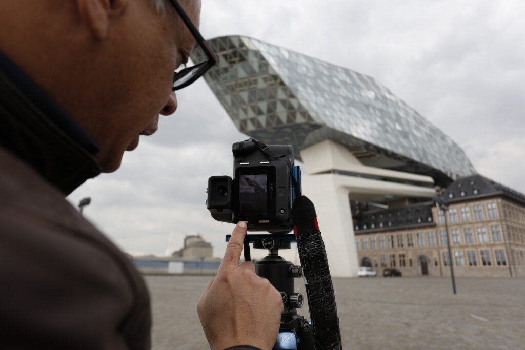
How do you think a 100MP Achromatic digital back could affect black and white photography?
“I think the way an achromatic digital back captures information consisting of differences in luminance only, is purer and contains less distracting information. Only the luminance value should be decisive. And that’s what an achromatic back does: it represents the world in very accurate luminance values only, exactly the way I want to present the world, with no distractions.”
“It’s a more ideal and accurate starting point for the photographer working in black and white. 100 megapixels is of course a big plus if you’re the type of photographer like I am who likes to print his architectural images large.”

Photographer Stories
Sandro Gamba – Beautiful food, passionate photography
Photographer Stories
Nike x SKIMS ‘Bodies At Work’ by Rob Woodcox
Photographer Stories
From vision to print: How Louise brings stories to life with medium format part 2

Photographer Stories
Intimacy in focus: Louise’s lens on humanity with Phase One part 1

Photographer Stories
Dimitri Newman: Vision is Just the Start
Photographer Stories
Ashes: The Rebirth of a Camera- Hexmalo

Photographer Stories
Chandler Williams: A Photographer’s Path

Photographer Stories
TABO- Gods of Light
Photographer Stories
Loreto Villarreal – An Evolving Vision
Photographer Stories
Tobias Meier – Storytelling Photography
Photographer Stories
Gregory Essayan – Curating Reality

Photographer Stories
Total Solar Eclipse – Matthew C. Ng
Photographer Stories
Roger Mastroianni – Frame Averaging
Photographer Stories
Matthew Plexman – Bringing portraits to life
Photographer Stories
Prakash Patel – A Visual Design Story